
Teamwork
Teamwork
Teamwork
creating a tool to help university students manage their group projects with ease.
creating a tool to help university students manage their group projects with ease.
creating a tool to help university students manage their group projects with ease.

Timeline
Timeline
Timeline
January - April 2024
January - April 2024
January - April 2024
Role
Role
Role
UX Design, UI Design, User Research
UX Design, UI Design, User Research
UX Design, UI Design, User Research
Tools
Tools
Tools
Figma, Mural,
Adobe Ilustrator
Figma, Mural,
Adobe Ilustrator
Figma, Mural, Adobe Ilustrator
Overview
Overview
Overview
Through a 14-week process, I designed an MVP for a tailored project management tool for students. This involved creating student personas to understand user needs, ideating solutions, building prototypes, and conducting a usability study to iteratively refine my designs.
Through a 14-week process, I designed an MVP for a tailored project management tool for students. This involved creating student personas to understand user needs, ideating solutions, building prototypes, and conducting a usability study to iteratively refine my designs.
Through a 14-week process, I designed an MVP for a tailored project management tool for students. This involved creating student personas to understand user needs, ideating solutions, building prototypes, and conducting a usability study to iteratively refine my designs.
Introduction
Introduction
Context
Context
As an undergraduate student, group projects were often a double-edged sword: promising collaboration, but delivering chaos.
As an undergraduate student, group projects were often a double-edged sword: promising collaboration, but delivering chaos.
As an undergraduate student, group projects were often a double-edged sword: promising collaboration, but delivering chaos.
The problem lay among the tools at my disposal: existing project management software, built primarily for large teams and businesses, proved overly complex and ill-suited for the needs of myself and my peers. This typically led to things falling apart as a result of poor organization, uneven workloads, and miscommunication.
The problem lay among the tools at my disposal: existing project management software, built primarily for large teams and businesses, proved overly complex and ill-suited for the needs of myself and my peers. This typically led to things falling apart as a result of poor organization, uneven workloads, and miscommunication.
The problem lay among the tools at my disposal: existing project management software, built primarily for large teams and businesses, proved overly complex and ill-suited for the needs of myself and my peers. This typically led to things falling apart as a result of poor organization, uneven workloads, and miscommunication.
Speaking to peers in my 4th year HCI course revealed a common struggle with complex project management tools. Most students relied on calendar reminders and group-chats on various social media platforms to coordinate their work, which often proved inadequate for managing multiple projects over the course of a semester.
Speaking to peers in my 4th year HCI course revealed a common struggle with complex project management tools. Most students relied on calendar reminders and group-chats on various social media platforms to coordinate their work, which often proved inadequate for managing multiple projects over the course of a semester.
Speaking to peers in my 4th year HCI course revealed a common struggle with complex project management tools. Most students relied on calendar reminders and group-chats on various social media platforms to coordinate their work, which often proved inadequate for managing multiple projects over the course of a semester.
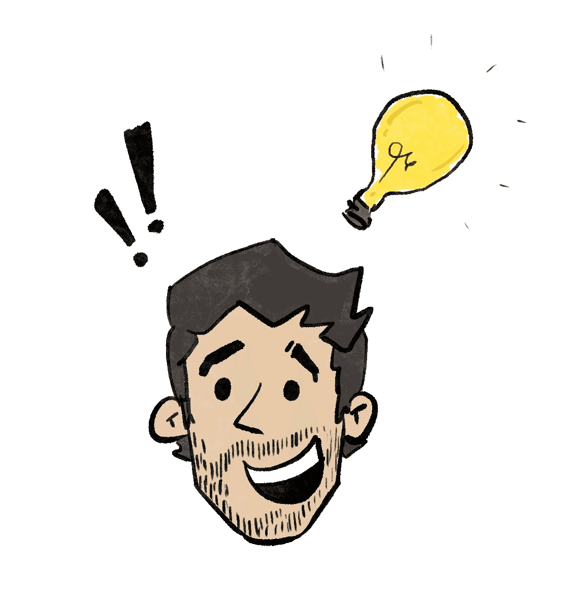
Suddenly, a 4th-wall breaking light bulb appeared above my head:
could I design a tool to address these challenges?
Suddenly, a 4th-wall breaking light bulb appeared above my head:
could I design a tool to address these challenges?
Suddenly, a 4th-wall breaking light bulb appeared above my head:
could I design a tool to address these challenges?
Understanding the users
Understanding the users
To broaden my understanding of the problem space and validate if my potential users actually existed, I conducted a survey with 76 students in my fourth year course. When analyzing the responses, a few things became glaringly obvious:
To broaden my understanding of the problem space and validate if my potential users actually existed, I conducted a survey with 76 students in my fourth year course. When analyzing the responses, a few things became glaringly obvious:
To broaden my understanding of the problem space and validate if my potential users actually existed, I conducted a survey with 76 students in my fourth year course. When analyzing the responses, a few things became glaringly obvious:
88%
88%
88%
Want a PM tool for students
Want a PM tool for students
Want a PM tool for students
Students were desperate for a solution - there was a significant interest among the data in a project management tool with a UX tailored to students.
Students were desperate for a solution - there was a significant interest among the data in a project management tool with a UX tailored to students.
Students were desperate for a solution - there was a significant interest among the data in a project management tool with a UX tailored to students.
73%
73%
73%
Struggle to organize projects
Struggle to organize projects
Struggle to organize projects
A significant majority of students faced challenges when organizing group projects, indicating a clear gap in existing tools.
A significant majority of students faced challenges when organizing group projects, indicating a clear gap in existing tools.
A significant majority of students faced challenges when organizing group projects, indicating a clear gap in existing tools.
67%
67%
67%
Face collaboration issues
Face collaboration issues
Face collaboration issues
Roughly two-thirds of students struggle with teamwork in group projects, highlighting a need for better collaboration tools in academic contexts.
Roughly two-thirds of students struggle with teamwork in group projects, highlighting a need for better collaboration tools in academic contexts.
Roughly two-thirds of students struggle with teamwork in group projects, highlighting a need for better collaboration tools in academic contexts.
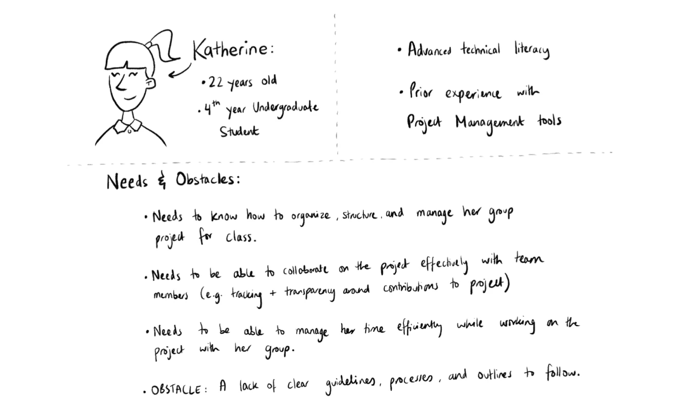
Using the key insights drawn from this data, I developed a persona to flesh out the different perspectives, challenges, and motivations of my user group. This helped me understand what my users cared about most, ultimately guiding my decisions to align with their best interests.
Using the key insights drawn from this data, I developed a persona to flesh out the different perspectives, challenges, and motivations of my user group. This helped me understand what my users cared about most, ultimately guiding my decisions to align with their best interests.
Using the key insights drawn from this data, I developed a persona to flesh out the different perspectives, challenges, and motivations of my user group. This helped me understand what my users cared about most, ultimately guiding my decisions to align with their best interests.
Defining the challenge
Defining the challenge
Armed with all this new knowledge, I crafted a problem statement that crystallized the most important challenges faced by the students I was designing for. This helped me establish a clear direction for the project by defining what it should be and how its impact can be measured.
Armed with all this new knowledge, I crafted a problem statement that crystallized the most important challenges faced by the students I was designing for. This helped me establish a clear direction for the project by defining what it should be and how its impact can be measured.
Armed with all this new knowledge, I crafted a problem statement that crystallized the most important challenges faced by the students I was designing for. This helped me establish a clear direction for the project by defining what it should be and how its impact can be measured.
🧩
🧩
🧩
Challenge
Challenge
Challenge
Project management tools are often too complex for students with limited work experience.
Project management tools are often too complex for students with limited work experience.
Project management tools are often too complex for students with limited work experience.
💡
💡
💡
Solution
Solution
Solution
A tool that aims to simplify group project management for students by being intuitive and user friendly.
A tool that aims to simplify group project management for students by being intuitive and user friendly.
A tool that aims to simplify group project management for students by being intuitive and user friendly.
📈
📈
📈
Evaluation
Evaluation
Evaluation
Success will be measured by positive user feedback, effective design iterations, and stakeholder approval.
Success will be measured by positive user feedback, effective design iterations, and stakeholder approval.
Success will be measured by positive user feedback, effective design iterations, and stakeholder approval.
Lo-fi Design
Lo-fi Design
Sketching out ideas
Sketching out ideas
To avoid falling into any rabbit holes, I gave myself a broad imaginary boundary and established that the scope of this project would be limited to a desktop app. Thus, I was able to ideate with the relevant technical and structural knowledge in mind (thank you, computer science degree).
To avoid falling into any rabbit holes, I gave myself a broad imaginary boundary and established that the scope of this project would be limited to a desktop app. Thus, I was able to ideate with the relevant technical and structural knowledge in mind (thank you, computer science degree).
To avoid falling into any rabbit holes, I gave myself a broad imaginary boundary and established that the scope of this project would be limited to a desktop app. Thus, I was able to ideate with the relevant technical and structural knowledge in mind (thank you, computer science degree).
I began the design process by brainstorming what features I could include as part of my tool in order to meet the needs of my users:
I began the design process by brainstorming what features I could include as part of my tool in order to meet the needs of my users:
I began the design process by brainstorming what features I could include as part of my tool in order to meet the needs of my users:

Simplified task management
Simplified task management
Simplified task management
Students can streamline project workflows by managing individual and shared tasks to ensure clarity, accountability, and efficient progress tracking.
Students can streamline project workflows by managing individual and shared tasks to ensure clarity, accountability, and efficient progress tracking.
Students can streamline project workflows by managing individual and shared tasks to ensure clarity, accountability, and efficient progress tracking.

Project calendar integration
Project calendar integration
Project calendar integration
A centralized team calendar would keep teams aligned on important dates and deadlines, improving time management and reducing scheduling conflicts.
A centralized team calendar would keep teams aligned on important dates and deadlines, improving time management and reducing scheduling conflicts.
A centralized team calendar would keep teams aligned on important dates and deadlines, improving time management and reducing scheduling conflicts.

Seamless file access
Seamless file access
Seamless file access
Students can store, organize, and access project files directly within the tool, or link to popular cloud storage services for seamless collaboration.
Students can store, organize, and access project files directly within the tool, or link to popular cloud storage services for seamless collaboration.
Students can store, organize, and access project files directly within the tool, or link to popular cloud storage services for seamless collaboration.

Onboarding flow
Onboarding flow
Onboarding flow
A guided, user-friendly setup process helps users quickly get stated, providing all the information essential for a smooth experience.
A guided, user-friendly setup process helps users quickly get stated, providing all the information essential for a smooth experience.
A guided, user-friendly setup process helps users quickly get stated, providing all the information essential for a smooth experience.
Drafting the MVP
Drafting the MVP
With sketching complete, I was left with several promising directions to pursue. However, given the 14-week constraints of my academic semester, I decided to focus on developing a comprehensive dashboard as the MVP of this project. This approach allowed for a deeper exploration of the tool's core functionalities while enabling early user testing.
With sketching complete, I was left with several promising directions to pursue. However, given the 14-week constraints of my academic semester, I decided to focus on developing a comprehensive dashboard as the MVP of this project. This approach allowed for a deeper exploration of the tool's core functionalities while enabling early user testing.
With sketching complete, I was left with several promising directions to pursue. However, given the 14-week constraints of my academic semester, I decided to focus on developing a comprehensive dashboard as the MVP of this project. This approach allowed for a deeper exploration of the tool's core functionalities while enabling early user testing.
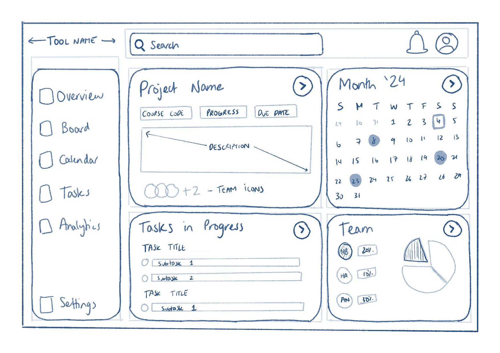
After some more line work, I put together a rough sketch of the dashboard, incorporating some of the features I ideated earlier:
After some more line work, I put together a rough sketch of the dashboard, incorporating some of the features I ideated earlier:
After some more line work, I put together a rough sketch of the dashboard, incorporating some of the features I ideated earlier:
Early testing
Early testing
Before moving forward, I wanted to gather some early-stage feedback to validate my design decisions, ensuring alignment with user needs. To guide my testing sessions, I focused on four key areas to investigate with the help of a low-fidelity prototype:
Before moving forward, I wanted to gather some early-stage feedback to validate my design decisions, ensuring alignment with user needs. To guide my testing sessions, I focused on four key areas to investigate with the help of a low-fidelity prototype:
Before moving forward, I wanted to gather some early-stage feedback to validate my design decisions, ensuring alignment with user needs. To guide my testing sessions, I focused on four key areas to investigate with the help of a low-fidelity prototype:
Information overload
is the dashboard overwhelming? if so, which elements cause this?
Information overload
is the dashboard overwhelming? if so, which elements cause this?
Information overload
is the dashboard overwhelming? if so, which elements cause this?
Dashboard clarity
can users easily identify and understand dashboard features?
Dashboard clarity
can users easily identify and understand dashboard features?
Dashboard clarity
can users easily identify and understand dashboard features?
User satisfaction
can users easily identify and understand dashboard features?
User satisfaction
can users easily identify and understand dashboard features?
User satisfaction
can users easily identify and understand dashboard features?
Feature relevance
which features do users find most valuable or unnecessary?
Feature relevance
which features do users find most valuable or unnecessary?
Feature relevance
which features do users find most valuable or unnecessary?
I conducted a total of four usability sessions after recruiting participants who aligned with the personas I developed. Upon completion, I used an affinity map to qualitatively analyze notes from each session, discovering the following:
I conducted a total of four usability sessions after recruiting participants who aligned with the personas I developed. Upon completion, I used an affinity map to qualitatively analyze notes from each session, discovering the following:
I conducted a total of four usability sessions after recruiting participants who aligned with the personas I developed. Upon completion, I used an affinity map to qualitatively analyze notes from each session, discovering the following:
Validations
Validations
Validations
Participants found the dashboard to be mostly intuitive to use and understand.
Participants found the dashboard to be mostly intuitive to use and understand.
Participants found the dashboard to be mostly intuitive to use and understand.
Dashboard information density was deemed appropriate by all participants.
Dashboard information density was deemed appropriate by all participants.
Dashboard information density was deemed appropriate by all participants.
All users felt the dashboard would make their group work easier to manage.
All users felt the dashboard would make their group work easier to manage.
All users felt the dashboard would make their group work easier to manage.
Users unanimously found the project overview card to be most valuable.
Users unanimously found the project overview card to be most valuable.
Users unanimously found the project overview card to be most valuable.
Preferences + Refinements
Preferences + Refinements
Preferences + Refinements
Some participants questioned dashboard scope: did the information cover single or multiple courses?
Some participants questioned dashboard scope: did the information cover single or multiple courses?
Some participants questioned dashboard scope: did the information cover single or multiple courses?
Most participants favoured shared project grades and task completion data over individual task metrics.
Most participants favoured shared project grades and task completion data over individual task metrics.
Most participants favoured shared project grades and task completion data over individual task metrics.
This initial user testing exercise successfully validated my progress and established a baseline for future design iterations. As for the refinements indicated by some participant responses, I prioritized iterative via low-fidelity sketches rather than on the prototype itself in the interest of time.
This initial user testing exercise successfully validated my progress and established a baseline for future design iterations. As for the refinements indicated by some participant responses, I prioritized iterative via low-fidelity sketches rather than on the prototype itself in the interest of time.
This initial user testing exercise successfully validated my progress and established a baseline for future design iterations. As for the refinements indicated by some participant responses, I prioritized iterative via low-fidelity sketches rather than on the prototype itself in the interest of time.

Course name + selection
Course name + selection
Course name + selection
This clearly identifies which course the information on the dashboard is associated with, and also allows for easy switching between projects.
This clearly identifies which course the information on the dashboard is associated with, and also allows for easy switching between projects.
This clearly identifies which course the information on the dashboard is associated with, and also allows for easy switching between projects.

Revised team display
Revised team display
Revised team display
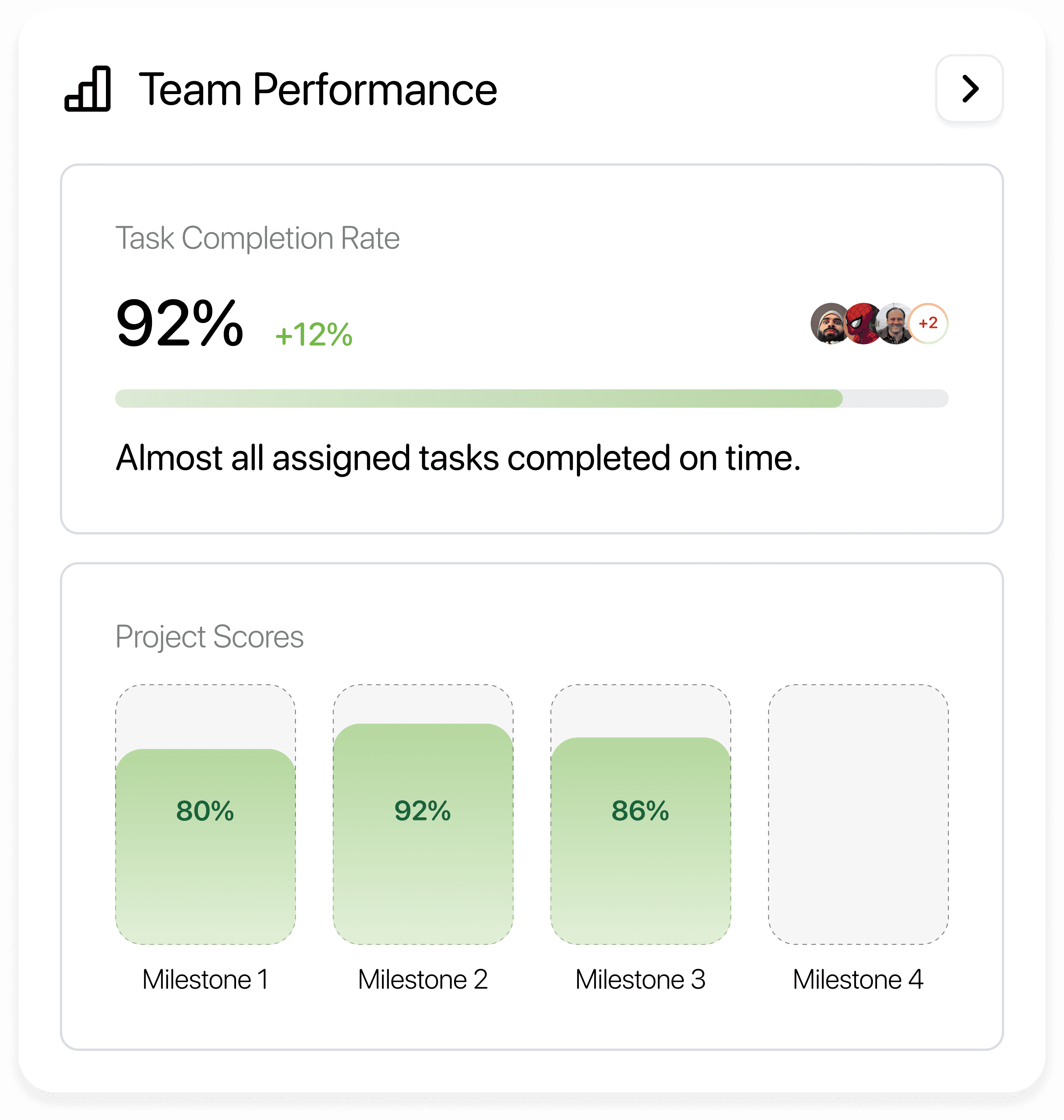
Based on what was heard from users, the content and datapoints displayed on the "team" card were refined for greater relevance.
Based on what was heard from users, the content and datapoints displayed on the "team" card were refined for greater relevance.
Based on what was heard from users, the content and datapoints displayed on the "team" card were refined for greater relevance.
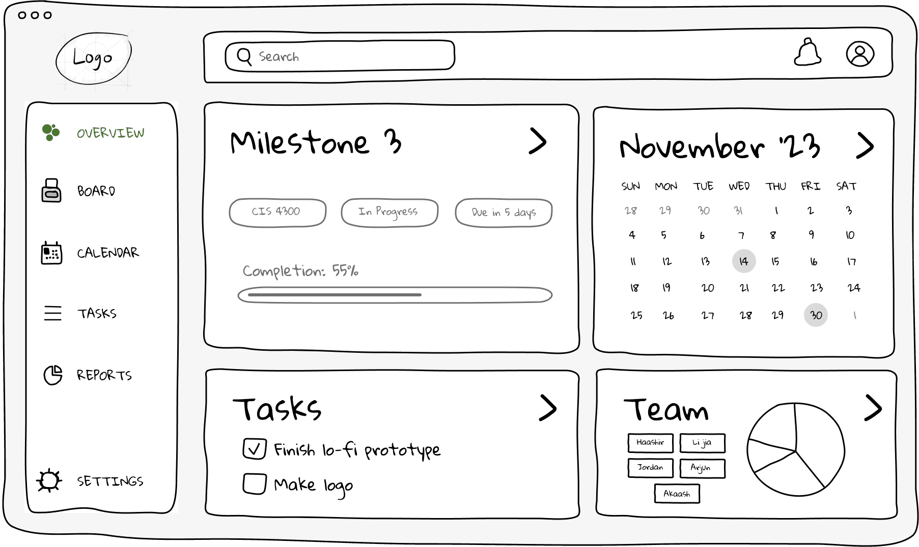
Hi-fi Design
Hi-fi Design
Design system
Design system
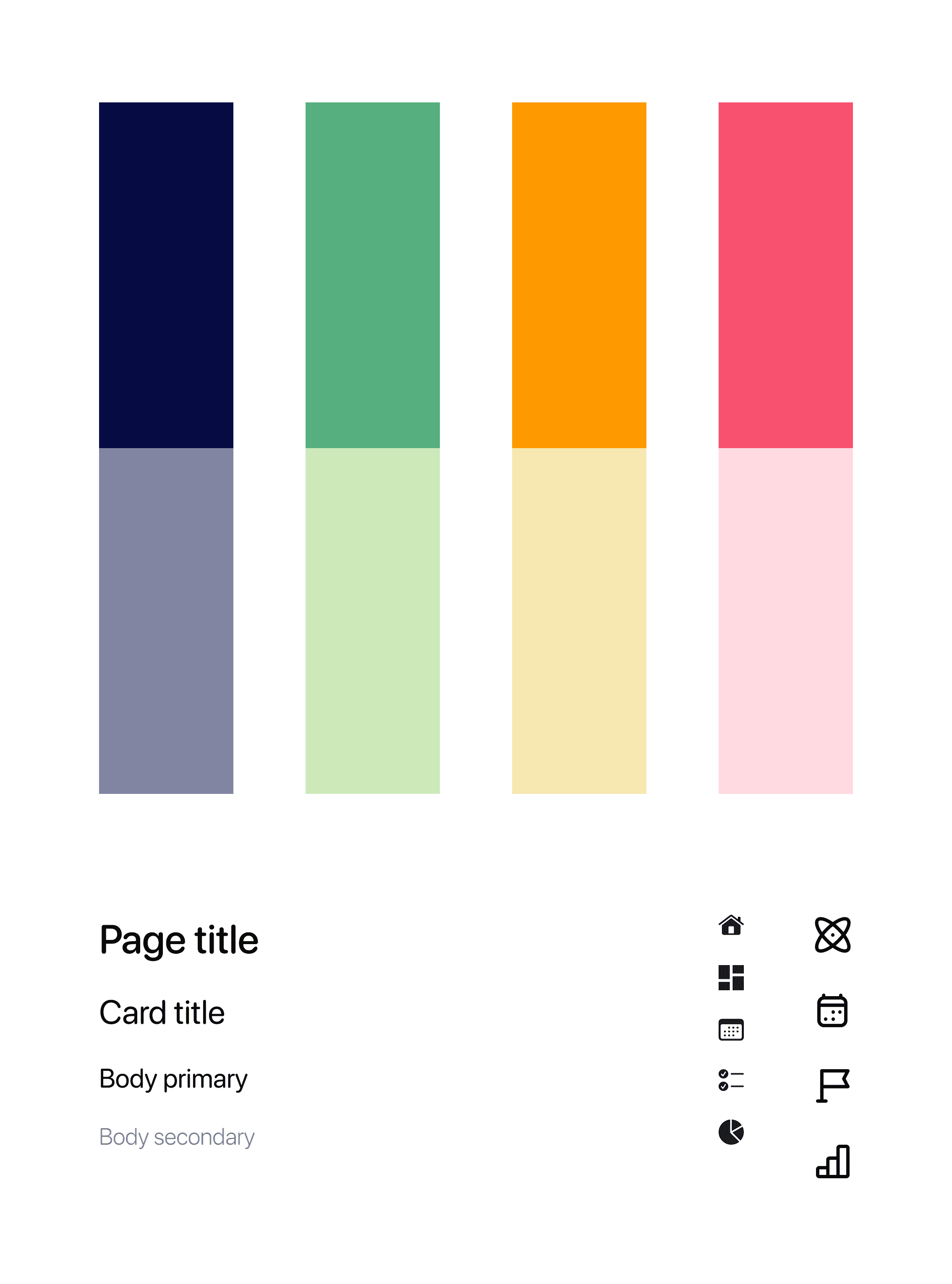
Guided by Apple's human interface guidelines, I established a grid system for the sidebar, content window, and feature cards to ensure appropriate dimensions and spacing for detailed components.
Guided by Apple's human interface guidelines, I established a grid system for the sidebar, content window, and feature cards to ensure appropriate dimensions and spacing for detailed components.
Guided by Apple's human interface guidelines, I established a grid system for the sidebar, content window, and feature cards to ensure appropriate dimensions and spacing for detailed components.
My design system consisted of reusable elements for the sidebar, content window, and feature cards. This not only streamlined the design process but also ensured a unified look and feel across the dashboard interface.
My design system consisted of reusable elements for the sidebar, content window, and feature cards. This not only streamlined the design process but also ensured a unified look and feel across the dashboard interface.
My design system consisted of reusable elements for the sidebar, content window, and feature cards. This not only streamlined the design process but also ensured a unified look and feel across the dashboard interface.

Each card offers a concise overview of key project data identified through the research, providing users with essential information at a glance. While the complete tool would have dedicated pages that offer in-depth details, the cards on the overview page are designed to help efficiently manage projects and facilitate quick decision-making.
Each card offers a concise overview of key project data identified through the research, providing users with essential information at a glance. While the complete tool would have dedicated pages that offer in-depth details, the cards on the overview page are designed to help efficiently manage projects and facilitate quick decision-making.
Each card offers a concise overview of key project data identified through the research, providing users with essential information at a glance. While the complete tool would have dedicated pages that offer in-depth details, the cards on the overview page are designed to help efficiently manage projects and facilitate quick decision-making.


Visual design
Visual design
There were a multitude of considerations made to ensure the dashboard was informative without looking overbearing or overcomplicated. I wanted to strike a balance between an informative and joyful experience:
There were a multitude of considerations made to ensure the dashboard was informative without looking overbearing or overcomplicated. I wanted to strike a balance between an informative and joyful experience:
There were a multitude of considerations made to ensure the dashboard was informative without looking overbearing or overcomplicated. I wanted to strike a balance between an informative and joyful experience:

Added contrast with glassmorphism
Added contrast with glassmorphism
Added contrast with glassmorphism
With a combination of opacity, blur, strokes, and gradients, I created an illusion of depth between foreground and background elements in the main content area. This helped distinguish each individual feature card while maintaining the page hierarchy of the tool.
With a combination of opacity, blur, strokes, and gradients, I created an illusion of depth between foreground and background elements in the main content area. This helped distinguish each individual feature card while maintaining the page hierarchy of the tool.
With a combination of opacity, blur, strokes, and gradients, I created an illusion of depth between foreground and background elements in the main content area. This helped distinguish each individual feature card while maintaining the page hierarchy of the tool.
Colours and typography
Colours and typography
Colours and typography
A vibrant colour palette helps enhance visual appeal and display progress across different cards on the dashboard. SF Pro Rounded ensures a modern and readable interface, with varying font weights and sizes to establish a content hierarchy.
A vibrant colour palette helps enhance visual appeal and display progress across different cards on the dashboard. SF Pro Rounded ensures a modern and readable interface, with varying font weights and sizes to establish a content hierarchy.
A vibrant colour palette helps enhance visual appeal and display progress across different cards on the dashboard. SF Pro Rounded ensures a modern and readable interface, with varying font weights and sizes to establish a content hierarchy.

Branding
Branding
Branding
I thought it would be fun to create a logo based on an octopus - my mind drew a connection between their adaptable nature, signified by their colour-changing ability, to the versatility required to handle multiple tasks and adapt to evolving project dynamics. (P.S. Can you tell his tentacles form a W shape?")
I thought it would be fun to create a logo based on an octopus - my mind drew a connection between their adaptable nature, signified by their colour-changing ability, to the versatility required to handle multiple tasks and adapt to evolving project dynamics. (P.S. Can you tell his tentacles form a W shape?")
I thought it would be fun to create a logo based on an octopus - my mind drew a connection between their adaptable nature, signified by their colour-changing ability, to the versatility required to handle multiple tasks and adapt to evolving project dynamics. (P.S. Can you tell his tentacles form a W shape?")
Gathering feedback
Gathering feedback
To validate the refined design and gather more detailed feedback, I conducted a second round of usability testing with the high-fidelity design. Through interviews conducted with six students who matched my persona profiles, I learned the following:
To validate the refined design and gather more detailed feedback, I conducted a second round of usability testing with the high-fidelity design. Through interviews conducted with six students who matched my persona profiles, I learned the following:
To validate the refined design and gather more detailed feedback, I conducted a second round of usability testing with the high-fidelity design. Through interviews conducted with six students who matched my persona profiles, I learned the following:
Insights + Refinements:
Insights + Refinements:
Insights + Refinements:
All participants appreciated the context provided by the course name + selection feature, validating the refinement made based on early feedback.
All participants appreciated the context provided by the course name + selection feature, validating the refinement made based on early feedback.
All participants appreciated the context provided by the course name + selection feature, validating the refinement made based on early feedback.
5/6 participants preferred the information on the new team performance card, validating the changes made after the low-fidelity testing.
5/6 participants preferred the information on the new team performance card, validating the changes made after the low-fidelity testing.
5/6 participants preferred the information on the new team performance card, validating the changes made after the low-fidelity testing.
4/6 participants expressed appreciation for the colour-coded progress indicators, finding them helpful for quick status assessment.
4/6 participants expressed appreciation for the colour-coded progress indicators, finding them helpful for quick status assessment.
4/6 participants expressed appreciation for the colour-coded progress indicators, finding them helpful for quick status assessment.
3 participants inquired about direct file access from the dashboard, suggesting an opportunity for future feature development.
3 participants inquired about direct file access from the dashboard, suggesting an opportunity for future feature development.
3 participants inquired about direct file access from the dashboard, suggesting an opportunity for future feature development.
Overall, this round of testing revealed several interesting insights, both validating earlier design decisions and highlighting areas for future refinement. It was also great to uncover that there was consistency in core validations across both the testing phases, with positive feedback on dashboard clarity, information density, and the value of the dashboard itself.
Overall, this round of testing revealed several interesting insights, both validating earlier design decisions and highlighting areas for future refinement. It was also great to uncover that there was consistency in core validations across both the testing phases, with positive feedback on dashboard clarity, information density, and the value of the dashboard itself.
Overall, this round of testing revealed several interesting insights, both validating earlier design decisions and highlighting areas for future refinement. It was also great to uncover that there was consistency in core validations across both the testing phases, with positive feedback on dashboard clarity, information density, and the value of the dashboard itself.
Retrospective
Retrospective
Was I successful?
Was I successful?
In short - yes! Revisiting my initial evaluation criteria, I can say with confidence that the high-fidelity dashboard is a successful MVP that brings me closer to a complete solution:
In short - yes! Revisiting my initial evaluation criteria, I can say with confidence that the high-fidelity dashboard is a successful MVP that brings me closer to a complete solution:
In short - yes! Revisiting my initial evaluation criteria, I can say with confidence that the high-fidelity dashboard is a successful MVP that brings me closer to a complete solution:
🤓
🤓
🤓
User feedback
User feedback
User feedback
Both low and high-fidelity testing phases yielded positive responses, with users appreciating the intuitive design and tailored features.
Both low and high-fidelity testing phases yielded positive responses, with users appreciating the intuitive design and tailored features.
Both low and high-fidelity testing phases yielded positive responses, with users appreciating the intuitive design and tailored features.
🎯
🎯
🎯
Effective design iterations
Effective design iterations
Effective design iterations
The project demonstrated a clear evolution from initial concepts to a refined high-fidelity prototype, with each iteration addressing user needs more effectively.
The project demonstrated a clear evolution from initial concepts to a refined high-fidelity prototype, with each iteration addressing user needs more effectively.
The project demonstrated a clear evolution from initial concepts to a refined high-fidelity prototype, with each iteration addressing user needs more effectively.
Final design + Reflection
Final design + Reflection

Despite the amount of progress made, I definitely think there's a lot more that can be done before the entire tool is ready-for-dev. The most obvious next steps would be building out the complete pages for each feature of the tool using an improved iterative approach. It would be great to test among a more diverse group of students as well as do so more frequently, as well as explore opportunities to increase the utility of the tool through mobile adaptation or integration with other academic tools.
Despite the amount of progress made, I definitely think there's a lot more that can be done before the entire tool is ready-for-dev. The most obvious next steps would be building out the complete pages for each feature of the tool using an improved iterative approach. It would be great to test among a more diverse group of students as well as do so more frequently, as well as explore opportunities to increase the utility of the tool through mobile adaptation or integration with other academic tools.
Despite the amount of progress made, I definitely think there's a lot more that can be done before the entire tool is ready-for-dev. The most obvious next steps would be building out the complete pages for each feature of the tool using an improved iterative approach. It would be great to test among a more diverse group of students as well as do so more frequently, as well as explore opportunities to increase the utility of the tool through mobile adaptation or integration with other academic tools.
For now, I'm happy with where I'm leaving this project, and will rest easy knowing that a future where group projects culminate in the best possible outcomes - free of chaotic mismanagement - may just be on the horizon.
For now, I'm happy with where I'm leaving this project, and will rest easy knowing that a future where group projects culminate in the best possible outcomes - free of chaotic mismanagement - may just be on the horizon.
For now, I'm happy with where I'm leaving this project, and will rest easy knowing that a future where group projects culminate in the best possible outcomes - free of chaotic mismanagement - may just be on the horizon.
Contact
Contact
Contact
Say hello!
Say hello!
Whether it's about design, music, or my world famous banana pudding recipe - I'm always happy to chat!
Whether it's about design, music, or my world famous banana pudding recipe - I'm always happy to chat!
Whether it's about design, music, or my world famous banana pudding recipe - I'm always happy to chat!
